Eric Gill
Eric Gill was a versatile talent, active in many disciplines from wood-engraving to sculpture and calligraphy. In the 1920s his creative abilities turned to type design and in 1928 Gill Sans was born. He was names royal designer for Industry by royal Society of Arts.
His most famous typeface is Gill Sans was issued by Monotype in 1928 to 1930. The roots of Gill Sans can be traced to the typeface that Gill’s teacher, Edward Johnston, designed for the signage of the London Underground Railway in 1918. Not completely satisfied with Johnston’s work, Gill set out to create the perfect, legible typeface.
“The first notable attempt to work out the norm for plain letters was made by Mr Edward Johnston when he designed the sans-serif letter for the London Underground Railways. Some of these letters are not entirely satisfactory, especially when it is remembered that, for such a purpose, an alphabet should be as near as possible ‘fool-proof’… as the philosophers would say—nothing should be left to the imagination of the sign-writer or enamel-plate maker.”
-Eric Gill, Essay on Typography, published 1931
Gill Sans rose to popularity it became the standard typeface for the London and North Eastern Railway , appearing on everything from locomotive nameplates to time tables. It is also called the “Helvetica of England”
Even today we can see it in use like in BBC World News, Tommy Hilfiger, United colours of Benetton and even Pixar.
SOURCES
http://idsgn.org/posts/know-your-type-gill-sans/
https://en.wikipedia.org/wiki/Eric_Gill
https://en.wikipedia.org/wiki/Eric_Gill
https://en.wikipedia.org/wiki/Eric_Gill
Herb Lubalin
Herb Lubalin was an American graphic designer well known for his type although he didn’t consider himself to be a typographer. He liked to play around with letterforms, had a playful approach to design and marvelled at how letters’ shapes changed the weight and meaning of words.
He was the cofounder of the International Typeface Corporation and he collaborated with Ralph Ginzburg on three of Ginzburg’s magazines- Eros, Fact and Avant Garde. In fact, one of his most famous typefaces was developed because of this collaboration.
He designed the logogram for Avante Garden magazine but due to the demand of a complete typesetting of the logo being extreme in the design community, Lubalin released ITC Avant Garde from his International Typeface Corporation in 1970. Unfortunately, Lubalin quickly realized that Avant Garde was widely misunderstood and misused in poorly thought-out solutions, eventually becoming a stereotypical 1970s font due to overuse.
Changes in technology, like phototypesetting - a process of projecting type onto film for printing, also encouraged Lubalin to experiment with his artwork.
What I really appreciate about his work is the fact that he’s never thinking about designing a typeface, rather, he designing a letter almost as if it was an artwork rather than a letter making each of his designs unique. Had he not been required to present the complete typesetting of the logo, ITC Avante Garde possibly wouldn’t have been called the cliche of the 1970s and would have preserved its unique character.
SOURCES
https://petrolicious.com/articles/herb-lubalin-was-controversial-at-times-but-always-great
http://www.graphics.com/article/herb-lubalin-master-typographic-logo
https://en.wikipedia.org/wiki/Herb_Lubalin#cite_note-Meggs-4
Jessica Hische
Jessica Hische is an American letterer, illustrator, and type designer. Best known for her personal projects, 'Daily Drop Cap’ and the 'Should I Work for Free' flowchart, she has also published "In Progress: See Inside a Lettering Artist's Sketchbook and Process, from Pencil to Vector" which gives an insight to her creative process and work she has completed as a hand lettering artist. She has worked for various clients ranging from Starbucks to The New York Times to Audible. Tilde, Buttermilk and snowflake are a few typefaces designed by her.
In her book “In Progress”, beginners interested in hand lettering (someone like me who has tried and failed miserable in hand lettering) will take away knowledge that they may not find on the Internet alone and professionals will enjoy the beauty and thoughtful presentation of the photos. One of the tips that I personally will follow is that she pencils everything down first. Which is logical but I personally haven’t done that while trying my hand at lettering. Looking at images of her book makes me realise that her book is a wonderful resource for reference, and she goes into detail about each style throughout. She also lists software and other useful tools for working with lettering digitally, including resources for building your own typefaces which is helpful considering the fact that I’m an aspiring Graphic Designer.
SOURCE
http://jessicahische.is/working
https://www.myfonts.com/fonts/jhische/snowflake/
Typography - Terms and Meanings
SERIF AND SAN SERIF

A serif is the little extra stroke found at the end of main vertical and horizontal strokes of some letterforms. Serifs fall into various groups and can be generally described as hairline (hair), square (slab), or wedge and are either bracketed or unbracketed.
A sans serif letterform is one that does not have "serifs" at the end of strokes.
BOWL

The closed, round or oval curve of a letter.
COUNTER

The open space in a fully or partly closed area within a letter.
LIGATURE

Two or more letters are joined together to form one glyph or character.
ASCENDER

An upward vertical stroke found on the part of lowercase letters that extends above the typeface’s x-height.
DESCENDER

The part of the letters that extends below the baseline.
X-HEIGHT

The height of lowercase letters reach based on the height of lowercase x; does not include ascenders or descenders.
DOUBLE-STOREY
A type of letter that has two counters
CAP HEIGHT

The height of a capital letter measured from the baseline.
BASELINE

The invisible line where all characters sit.
STRESS

An imaginary line drawn from top to bottom of a glyph bisecting the upper and lower strokes is the axis.
BALL TERMINAL
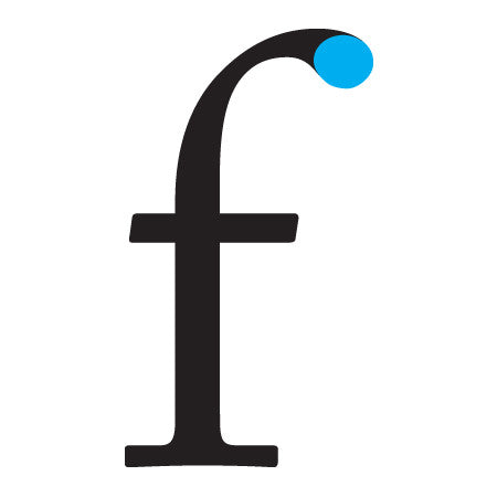
A circular form at the end of the arm in letters.
KERNING
The horizontal spacing between two consecutive characters; adjusting the kerning creates the appearance of uniformity and reduces gaps of white space between certain letter combinations.
LEADING
The vertical spacing between lines of text (from baseline to baseline).
SOURCE
Modular Typeface
Modular Typeface
A modular typeface is an alphabet constructed out of a limited number of shapes or modules.


Cardboard Alphabet by Antonio Rodrigues Jr
This is a modular typeface where all the letters are created using 6 basic shapes or modules.
Type Specimen
Type specimen refers to any kind of presentation of a certain typeface to showcase its design and/or use.
A type specimen is really important as it not only allows the designer to showcase his/her typeface to the world as simply or elaborately he/she wishes to but also allows the customer to see and have a feel what the font looks like when in use before purchasing it.
LARS (-Bold Decisions)


On the day of our crit, my tutor, William, suggested I research a typeface designed by the typefoundry Bold Decisions as it closely related to my work. Although I was unable to find much about it, I did stumble across a type specimen for their font. On further research I found out that the illustrations on this specimen were done by my tutor - William.
The narrative context of this specimen uses odd and funny headlines taken from UK's newspapers. And William did illustrations for these headlines which in my opinion does justice to the specimen as the reason why they chose to do this was to show the quirky, versatile and playful personality of their typeface.
Originally designed by Mads Wildgaard in a single weight as a graduation project while studying at the Gerrit Rietveld Academy in 2014, the font is now available in 11 alternative weights and styles, “with many more currently being developed”.