First things first, this post isn’t about what the lecture was about, it's about what I interested me the most during the lecture.
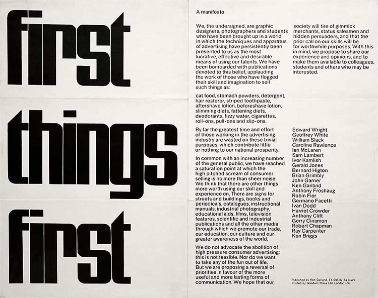
We started the lecture by reading the First things First 1964 manifesto and providing our views on it.
- What was the main argument in the manifesto?
The designers who signed the manifesto were trying to say that design is more than just designing adverts for “gimmick merchants” and “hidden persuaders”. Design can do so much more like bettering the society and the world rather than being used to ‘sell; things. They invite other designers to reverse their priorities. This manifesto is in way ironical. Rather, it’s a request, an invitation to consider these things and really reflect on what actually matters and how can your design ACTUALLY be useful.
- Do you still think it’s relevant today?
Yes. Definitely. More so now than ever. With more problems arising today(global warming, sustainability, equal rights, etc) design can definitely be used to bring about a change, to raise awareness.
- What would you add to it?
The manifesto mostly focuses on graphic designers and photographers. It would be great to invite designers from other creative fields as well.
This manifesto was updated in 2000. It touched upon the same topics of designers being too focused on “inessential” things and invited designers to help with cultural interventions, social marketing campaigns, educational tools, charitable causes and information design projects to name a few - area that urgently required our expertise.
We also looked at graphic design examples that sought to make an impact and make people aware of certain issues. The one that I really liked about the presentation was the Litmus paper billboard. We always talk about climate change but most never really do much about it. Seeing a billboard change colour just from rain shows how toxic our world is becoming and how important it has become to make a change.

It also reminded me of the two exhibitions I visited last year. The first one being ‘Can graphic design save your life?’ That was held in the Wellcome Collection. It had a variety of graphic design examples. One of them showed the “persuasive” strategies used in manipulating public perception around smoking.

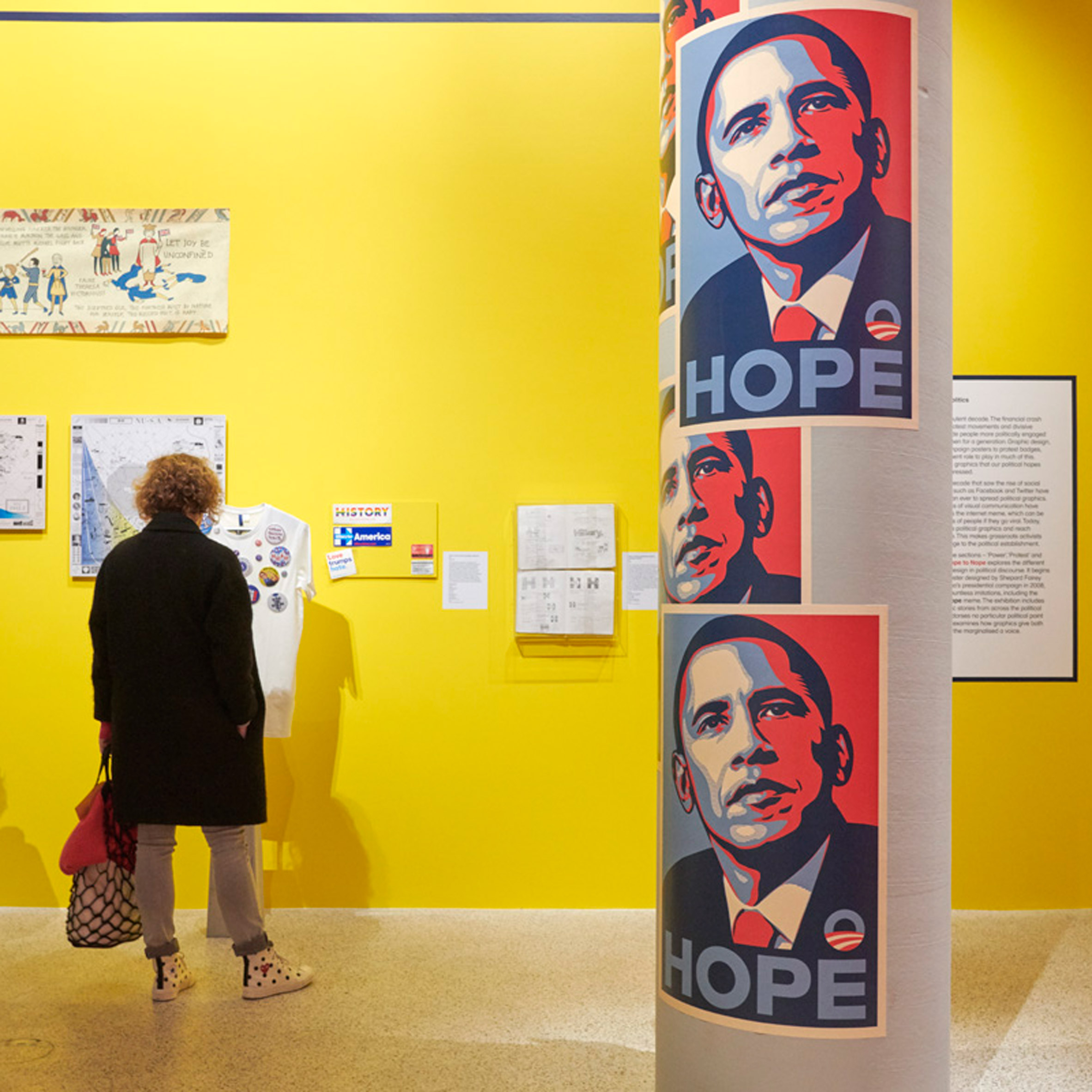
The second one is the Hope to Nope exhibition that was shown at the design museum. It showed the history of political protests, how social media affected it and how graphic design has evolved in this context.
There was also a clip from ‘Modern Times’ starring Charlie Chaplin. It mocked industrialisation and the fact that individuals were having to work like machines. It shows that the owner only cares about efficiency keeps accelerating beyond the labourer’s capacity to keep up.
We also touched upon topics like art and crafts movement, Bauhaus and post-war consumerism.
World War II changed everything, from culture and entertainment to all other aspects of life. In the 1950s, America saw an economic boom which allowed the people to buy more things. As a result, there was an opportunity to sell more. And to sell more, ads were made. The ads made Americans hope for the future; they promised a peacetime world of leisure and relaxation, thanks to fantastical-time saving devices. They represented their products as the modern way of living. Marketers continued to offer "new and improved" products to maintain high consumer demand. That focused selling technique relied on newly popular methods such as motivational research, demographic targeting and generational marketing. Vance Packard wrote ‘The Hidden Persuaders’ in 1957 to criticise and reveal how advertisers use psychological methods to tap into the unconscious desires in order to "persuade" consumers to buy the products they are selling.