Fashion and Textiles
Balenciaga
Cristóbal Balenciaga was one of the most revered fashion designers of the 20th century. His clothes were characterised by their sculptural quality, deft manipulation of textiles and dramatic use of colour and texture. His contemporaries called him The Master.
From the late 1930s, Balenciaga was a huge international success. The house of Balenciaga at 10 Avenue George V was the most exclusive and expensive couture establishment in Paris. The façade, displaying abstract sculptures, revealed nothing of the visionary fashion being created inside. Clients entered through a large wooden door, then took a leather padded lift up to the third floor. There they saw models parade the designs or had garments fitted.
Twice a year the new collection was shown in the Grand Salon. Balenciaga courted controversy in 1956 when he barred the press from his initial showings. Concerned with protecting his designs from illegal copies, he made journalists wait a month before they could view and publish them. His disciple Hubert de Givenchy joined him, and for ten years, the two were such beacons of the fashion world that foreign journalists made additional trips to Paris just to cover the Balenciaga and Givenchy shows.
The strong architectural shape of this dress relies on its fabric: a stiff silk gazar stands away from the body and holds its form.
The main dress is made of a single piece joined at the back with no side seams- a characteristic of Balenciaga's designs. A second panel of fabric hangs from the shoulders and is secured with bar tacks under the arms, creating the illusion of a loose, unstructured garment. Underneath, however, a stiff corset ensures a secure fit.
As in many Balenciaga's designs, the plain front of this 'Tulip' dress reserves interest for the back, with its reminiscent of a Japanese kimono.
Some of Balenciaga's most innovative designs were also the simplest. Here a T-shaped kimono cut is manipulated into dramatic folds by an invisible internal ribbon, which runs the length of the inside sleeves and holds the gathers in place. Vogue described it as having the 'sculptured, direct beauty of a Roman toga'.
'Almost air-borne' was how Vogue described this historically inspired evening dress. 'Taffeta as thin as burning paper, shaped into harem skirts, Balenciaga's source: the balloon skirts of the women of Ibiza, who look like clouds walking.'
Skilfull draping of the finest silk taffeta created this effect. Great swathes of fabric, supported by hoops, are drawn towards the back from the centre front seam. The skirts are shaped through 'bagging out', which creates spacious voids which fill with air as the wearer walks. At the hem are ties which knot above the knee, lifting and ballooning the hem for yet for drama.
This dress is embroidered 'to shape'. The pattern pieces arrived at the embroider's workshop already measured, with the seam and hem allowances marked. To ensure no needlework was wasted, the embroider stiched only within the designated areas.
Eight curved panels make up the body of the dress, ensuring it hugged the wearer. Balenciaga designed it to be full length, making the most of the unusual pattern. This shorter version was probably made at the client's request.
3-Dimensional Design and Architecture
Made To wear (CSM Library - 739.27 WES)
"Jewellery, like clothing, is ubiquitous. The person who says that they do not wear jewellery is probably discounting a watch, a badge, a sentimental object they carry around with them. Most enjoy or even glory in wearing, owning or giving the portable decoration that is jewellery.
The status of jewellery is affected by this attitude. The importance of jewellery is easily overlooked and yet it is so widely consumed...."
"What does a jeweller do? A jeweller makes jewellery- it seems so obvious, but the term encompasses a range of occupations, ideas, materials and processes. The finished product may be created for the unrelenting use of everyday wear or remain passive under glass and regard of millions of museum visitors..."
"The ability to design must contain a strong element of communication. The audience or potential consumers of jewellery must always be a part of the conscious or unconscious equipage of the jeweller's creative mind..."
"For Giles Last, the boundaries between art, craft and design are meaningless by enamel. He has also moved his work from confines of formal education into the community. When Last graduated, he started working for a project which had been set to teach enamelling to people with disabilities in Deptford, South London. The project had been running successfully for several years. The project showed the versatility of enamel: it can be used by the inexperienced to create worthwhile work relatively simply. Its alchemical process transforms the base into something shining and colourful.
I enjoy working with people as well as being closed off in a studio and I gain a lot of my inspiration from everyday life, personal histories and the world around me. That sort of thing I find does transfer very clearly into visual shapes and forms. I've always enjoyed working with different types of community, not necessarily art schools. The closer you get to community you live in the more interesting it gets, so I do like social history and the people side of things.
Enamel is a particularly difficult technique, whether applied to silversmith or jewellery. There are still no quick and easy ways of practising this technique. It might appear to be out of tune with the times in which we live and yet it provides possibilities of light and colour on metal which are impossible to create in any other way."
1000 Product Designs: form, function and technology from around the world (CSM Library - 745.2 CHA)
"Before we work, before we eat, before we relax, we sit. Chairs have remained functionally identical for centuries, existing as icons of cultural activity that perpetually hover 18.5 inches above the floor. And they remain one of the designer's favourite media, a blank slate onto which explorations of material, form and shape can be cast.
Some chairs are reductive and some embellished; some comfortable and some foreboding; some meant for work and some for play. Regardless of their form or feel, however, chairs remain both icons of function and expressions od designer's craft. They will forever remain an integral part of the vocabulary of design."
Fifty Chairs That Changed The World (CSM Library - 749.32 DES)
Thonet
An ubiquitous addition to cafes, bars, and public spaces, the Thonet Side chair is probably one of the most recognizable, most produced, and most reinterpreted chairs of all time. The chair is made out of a series of mass-produced bentwood components that are then screwed together.
Polyprop
Universale
The Universale was the result of designer Joe Colombo's efforts to make a chair that could be cast as a single piece. Its extra attraction was a system of detachable screw-on legs that could transform the seat from a standard height chair to a high stool.
Wiggle Side Chair
The wiggle side chair- Frank Gehry's furniture is every bit as innovative, playful and surprising as his architecture.
Tree Trunk Bench
The Tree Trunk Bench challenges traditional chair design and materials with engaging wit. This bench is seating for the imagination- forcing us to think about its former incarnation as a tree and the intellectual journey that has transfigured it into a domestic object.
3DDA - My Works
Jewellery, Footwear and Fashion Accessories
Product Design and Ceramics
Architecture
Graphic Communication Design (Extra Research)
I visited the Wellcome Collection where an exhibition called "Can Graphic Design Save Your Life" was on the show. Although I couldn't take photographs of the exhibits, I noted down the relevant information of the exhibits that I enjoyed looking at.
(All photographs shown below have been taken from the internet. Links are in the bibliography.)
1. Infographics: Human Body
Illustrator: Peter Grundy. Author: Simon Rogers. Publisher: Big Pictures Press
Peter Grundy is considered to be a pioneer of infographics, the visual representation of information often in the form of a chart or diagram. In 1980 he set up the design group Grundy & Northedge, which had a playful approach to infographics. This is his first children's book. While his brief was to create a book for young people that explains how the human body works, he wanted to avoid conventional medical illustration and use information design as a form of storytelling instead.
Information Graphics: Human Body shows just how interesting and humorous scientific information can be. Complex facts about the human body are reinterpreted as stylish infographics that astonish, amuse, and inform.


2. The Human Body: A Three-Dimensional Study
Illustrator: David Pelham. Author: Jonathan Miller, David Pelham. Publisher: Jonathan Cape.
From 1968 to 1979 David Pelham was the art director for Penguin Books, where covers such as A Clockwork Orange demonstrated his keen eye for illustrating text with arresting images. On leaving Penguin, Pelham concentrated on his own publishing projects. The human body was developed with medical doctor and television presenter Jonathan Miller. Their book includes pop-ups that encourage the reader to look right inside the body and, by moving parts of the pages, to see how its many parts work.
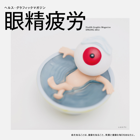
3. Health Graphic Magazine
Designer: DODO DESIGN. Publisher: Aisei
Health Graphic Magazine is published three times a year by Japanese pharmacy chain Aisei and is given away for free in their stores. Each issue is themed around one common health issue- from obesity to headaches, sinus problems to eye strain- which is featured as a single witty cover image. Strikingly original and humorous, the magazine's designers employ information graphics and the visual language of graphic novels to inform and educate, not just to promote Aisei products.

4. N+M Medical Journal
Designer: Erwin Poell. Client: Boehringer Mannheim
N+M was a medical journal distributed by leading pharmaceutical company Boehringer Mannheim. Its title was short for Naturwissenschaften und Medizin (Natural Science and Medicine). The journal's aim, in addition to promoting Boehringer Mannheim products and brand, was to provide doctors with the latest scientific research. Erwin Poell designed covers that were consistently eye-catching, using strong colour, punchy graphics and different degrees of abstraction to catch the reader's attention.


5. The Feeling of Pain
Designer: Yin Yao
Yin Yao's final year project at the London College of Communication explored ways of visualizing pain. He was motivated to investigate this after struggling to desc4ibe to medics the physical sensations of his own severe migraines. Using a combination of historical image-based research and his own graphic experimentation, Yao surveyed 100 people to find out whether differences of age, gender or nationality had any bearing on how people might visually represent pain and its intensity.


6. Vårdapoteket Pharmacy's branding
Designer: Stockholm Design Lab. Illustrator: Kari Modén. Photographer: Felix Odell.
In 2010 the Swedish government privatised its previously state-run outpatient hospital pharmacies, forming a chain called Vårdapoteket. Stockholm Design Lab was commissioned to develop its identity which could afford to be experimental given its guaranteed market. Inspired by the human body, Stockholm Design Lab worked with Illustrator Kari Modén to create vibrantly coloured images on bags, wallpaper, signage, and information. The shops stood out in what were otherwise sterile spaces, increasing sales by 30%.


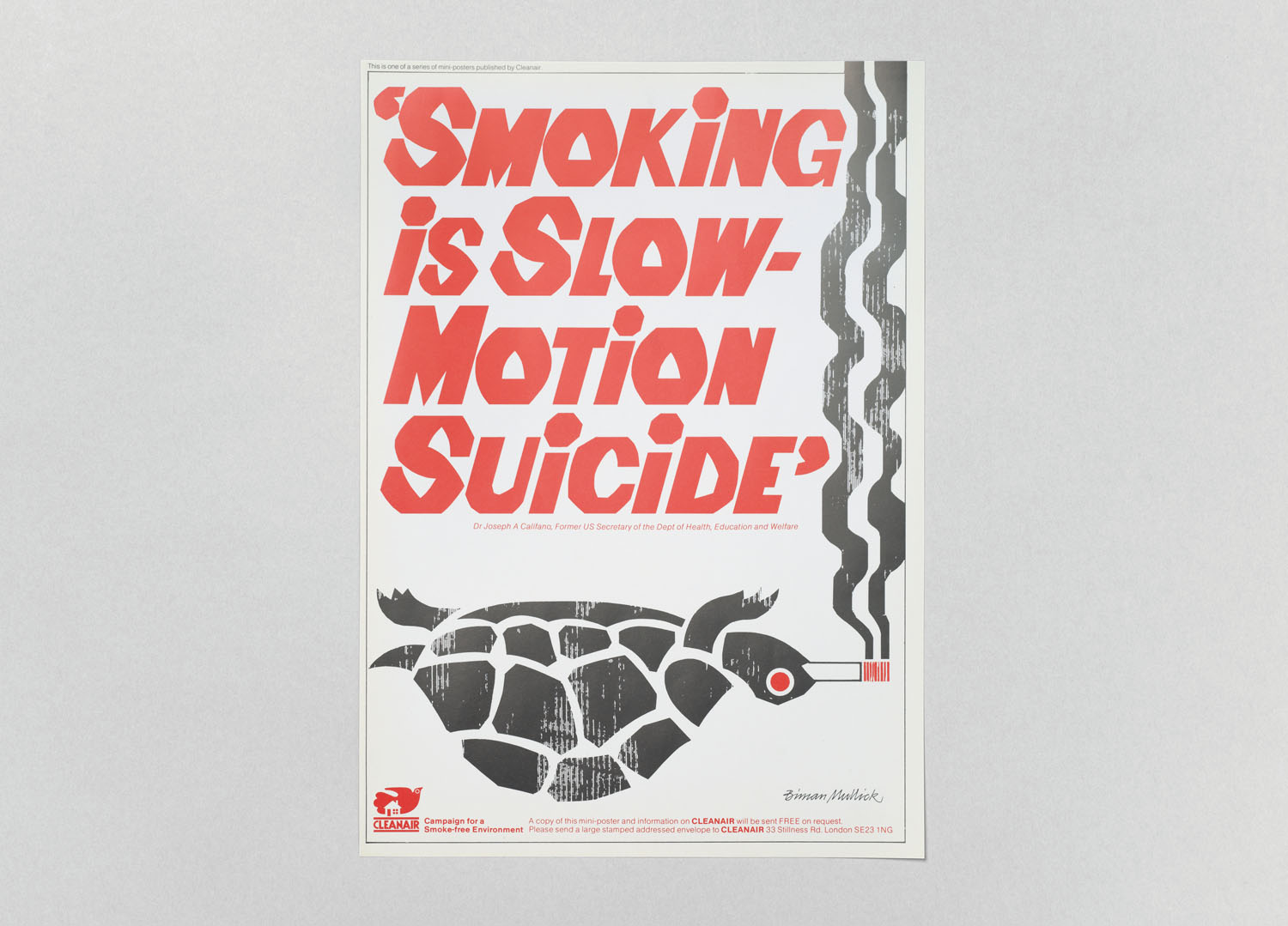
7. Anti-Smoking Stamps.

8. CLEANAIR
Creator: Biman Mullick

9. Man as Industrial Palace
Creator: Fritz Kahn
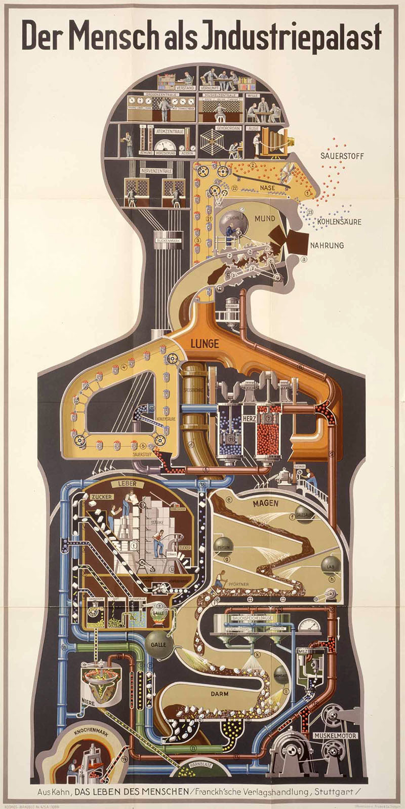
The above is a "strikingly metaphorical poster which shows the inside of the body as a factory hard at work."
10. NHS Blood Donor Campaign
This site-specific campaign uses augmented reality technology to allow members of the public to virtually donate their blood using their mobile phone. Participants are given a sticker detectable by the visual recognition that overlays a needle, tube, and plaster on their arm. The augmented reality app connects to a large outdoor advertising screen showing a sick patient attached to an empty blood bag- as the virtual blood fills the bag, the patient is shown returning to health.


[Bibliography
All the pictures above have been taking from the following links.
http://www.bigpicturepress.net/our-books/i-see-what-you-mean-human-body/
http://mikedempsey.typepad.com/graphic_journey_blog/2013/11/david-pelham-cover-story.html
http://www.ccplusmedia.com/health-graphic-magazine/
https://in.pinterest.com/davedye/nm-science-magazine-covers-by-erwin-poell/?lp=true
http://www.yaoyindesign.com/MP-Visual-Summary
http://www.stockholmdesignlab.se/vardapoteket/
https://www.creativereview.co.uk/biman-mullick-anti-smoking-posters/
http://socks-studio.com/2012/08/24/fritz-kahn-human-body-as-an-industrialized-world/
Graphic Communication Design
Yoko Ono's Cut Piece.
In this performance, Ono, the artist sat kneeling on the concert hall stage, wearing her best suit of clothing, with a pair of scissors placed on the floor in front of her. Members of the audience were invited to approach the stage, one at a time, and cut a bit of her clothes off – which they were allowed to keep.
Ono has discussed the work in several different ways. She has characterized it as a test of her commitment to life as an artist, as a challenge to artistic ego, as a gift, and as a spiritual act. Ono’s inspiration for Cut Piece was the legend of the Buddha, who had renounced his life of privilege to wander the world, giving whatever was asked of him. His soul achieved supreme enlightenment when he allowed a tiger to devour his body, and Ono saw parallels between the Buddha’s selfless giving and the artist’s. When addressing serious issues – in this case, voyeurism, sexual aggression, gender subordination, violation of a woman’s personal space, violence against women – Ono invariably found means to combine dangerous confrontation with poetry, spirituality, personal vulnerability, and edgy laughter.
One of the main reasons that this work intrigued me was the fact that even though it was a performance, it was shown to us as a graphic communication example which shows that how various disciplines can be interconnected.
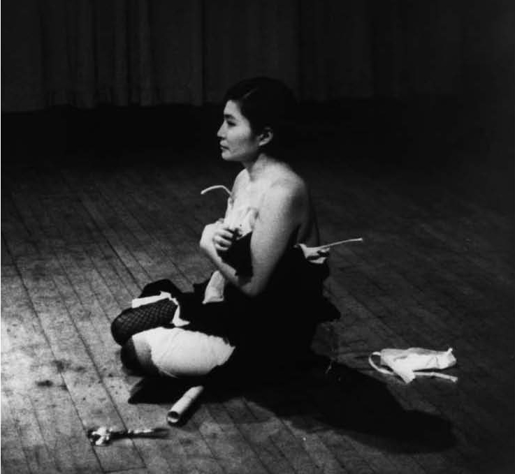
Yoko Ono, Cut Piece, 1964. Performed on March 21, 1965, at Carnegie Recital Hall, New York. Photo: Minoru Niizuma, © Yoko Ono; Courtesy of Lenono Photo Archive.
[BIBLIOGRAPHY
http://imaginepeace.com/archives/2680 ]
TANGIBLE (CSM LIBRARY - 741.6KLA)
TACTILE (CSM LIBRARY - 741.6KLA)
NOT A TOY (CSM LIBRARY - 391.0905NOT)
PULLED (CSM LIBRARY - 764.8PER)
FINGERPRINT (CSM LIBRARY - 741.6CHE)
CREATIVE REVIEW 1998 (CSM LIBRARY - UPPER FLOOR)
(The following statements have been quoted from the picture above.)
"Not every typeface is transparent, not all typography recedes; certain types symbolise philosophies and ideologies, some represent institutions, nations and cults, many have intrinsic meaning..."
"Typefaces and typography are never designed in a vacuum. Practical and commercial motivations prevail but social and political rationales are never far away. Type design typography are routinely informed by conscious and unconscious contexts that change with time."
Fine Arts - Collection
From the Monday's lecture, one of the artists whose collection I really found interesting was Dieter Roth. When I first read our project brief, "waste" was one of the things I thought that I could collect. I was really impressed with Roth's collection of waste. Many of Roth’s works can be understood as kinds of diaries. In the mid-1970s, he attempted to record a year of his life by collecting and preserving all items of waste less than 5 mm thick. The resulting work, ‘Flacher Abfall / Flat Waste’ (1975 – 1976), celebrates and subverts the ordering principle of a diary while addressing Roth’s artistic role as collector, cataloguer, and archivist.
Another artist Whose collection I liked was Richard Wentworth's 'Making Do and Getting by'. He captured pictures of improvisation, where objects are removed from their original context, stripped of their ordinary function and yet often rendered functional in an altogether new and unexpected way. A car door serves to mend a wire fence. Wooden crates, wedged into a doorway, exert the function of a door. There occurs a rupture between object and function, which allows a subsequent rupture between function and meaning. Meaning is no longer hinged on the commonplace and uniform functionality of the mass-produced object, but rather augmented by the unfamiliar and, thus, noteworthy new function with which the object is instilled. Wentworth’s photographs bear witness to instantaneous transformations, wherein everything is celebrated for its conversion into something else.
Taryn Simon's "The Innocents" was also an interesting collection. The collection documents the stories of individuals who served time in prison for violent crimes they did not commit. This is interesting because each photograph in her collection has a different and unique story behind it but at the same time they all are bound by a common element. The primary cause of wrongful conviction is a mistaken identification. A victim or eyewitness identifies a suspected perpetrator through law enforcement’s use of photographs and lineups. This procedure relies on the assumption of precise visual memory. But, through exposure to composite sketches, mugshots, Polaroids, and lineups, eyewitness memory can change. In the history of these cases, photography offered the criminal justice system a tool that transformed innocent citizens into criminals. Photographs assisted officers in obtaining eyewitness identifications and aided prosecutors in securing convictions.
I also enjoyed looking at Matthew Day Jackson's work as his collection of photographs was very similar to mine. He photographed anthropomorphic land formations in the course of a four-month drive through the continental United States. While some were very evident, others were camera shy and had to be coaxed out of hiding – only from certain camera angles would they agree to expose themselves.
Wellcome Collection
I visited the "Medicine Man" at the Wellcome Collection Museum. I was really intrigued by the collection of Glasswares as it really reflected on Henry Wellcome's habit of collecting hundreds of near-identical examples of objects. These jars were usually used by chemists and scientists and when displayed, they were filled with blue and red liquids which symbolized blood.
Pareidolia
My collection consisted of photographs of objects that looked like a face. This psychological phenomenon in which the mind responds to a stimulus, usually an image or a sound, by perceiving a familiar pattern where none exists (e.g., in random data) is called Pareidolia. The word is derived from the Greek words para, meaning something faulty, wrong, instead of, and the noun eid?lon, meaning image, form or shape. Pareidolia is a type of apophenia, which is a more generalized term for seeing patterns in random data.
These pictures are a few more examples of Pareidolia-
[Bibiography
-http://www.gupmagazine.com/articles/making-do-and-getting-by
-http://tarynsimon.com/works/innocents/#1
-http://www.saatchigallery.com/artists/artpages/matthew_day_jackson_lower48_photography.htm
IDEAS FACTORY
Animism (noun)
The belief in a supernatural power that organizes and animates the material universe.
Animism is the belief that everything has a soul or spirit, an 'anima' in Latin, including animals, plants, rocks, mountains, rivers, and stars. Animists believe each 'anima' is a powerful spirit that can help or hurt them and are to be worshipped or feared or in some way attended to. Animism is a primitive religion whose adherents have for thousands of years deified animals, stars, and idols of any kind, and practiced spiritism, witchcraft, divination, and astrology. They use magic, spells, enchantments, superstitions, amulets, talismans, charms, or anything that they believe will help to protect them from the evil spirits and placate the good spirits that are found everywhere in everything. While researching Animism we came across shamanism which is basically "applied animism".
The earliest tangible manifestations of man's religious awareness have been found in prehistoric cave sites. One of the most characteristic examples of cave art was discovered in the Franco-Cantabrian cave of Les Trois-Frères. These paintings depict a hunter-sorcerer armed with a bow and disguised as a bison, amidst a herd of wild beasts. Another example of a sorcerer wearing horned headgear to deceive his prey was also found on the same site.
Hang
While researching this process, I tried to look at various aspects of what hang as a process could mean like-
-animals that hang
-capital punishment where the prisoner is hanged
-literally hanging things from something like clothes.
I mostly researched on animals that hang to connect it to animism. One of the animals that really intrigued me was bats. I researched on their wings and how they fly and the shape and structure of their wings.
Hanging has also been a primitive way of punishment. It started with nothing more than a tree and length of rope. Today hanging is a scientific art, developed over the centuries into a quick, clean mode of death. Early man meted out his vengeance on his neighbour by hanging- he simply threaded a rope across a branch and hoisted his victim, with a noose around his neck, off the ground. Death usually came about through strangulation. This kind of primitive "justice" was still used by lynch mobs many centuries later. The first scientific approach came about during Anglo-Saxon times when a ladder was used in tandem with a purpose-built wooden gallows. Now the condemned man was forced up the ladder which was subsequently 'turned out' so he lost his footing and fell to his death. However, the fall was a short one. In some cases, the victim's neck was broken but this was rare. As before, death- which was slow and painful- was usually due to strangulation.
The above picture shows the structure and shape of a bat's wing.
Hair
While researching about hair I tried taking two approaches- animal hair (which includes human hair) and plant hair, also known as trichomes.
Hair seems to take a delight in surprising us. While we think it fragile and that a situation hanging by just a hair seems extremely precarious, in fact, hair is incredibly resilient. While it is not obvious when handling a single hair, you only need to try to break a small lock to be convinced: hair is extremely strong.
The organization of keratin within its cortex allows it to resist a strain of up to about a hundred grams. A lock of 100 hairs can thus withstand a weight of 10 kilograms. As to the average head of hair, it could withstand 12 tons, if the scalp were strong enough! Before breaking, a hair undergoes changes. For example, by delicately handling a reasonably long hair it can easily be shown that it behaves like a piece of elastic; after extending slightly, it returns to its original length.
The use of the extensometer which progressively stretches a hair at the rate of 1 cm per minute allows a precise study of the modifications hair undergoes before it breaks.
Thus, for lengthening of up to 5%, hair is elastic. This is due to the structure of the keratin molecule. Called keratin in its natural state, stretching arranges it into keratin b. When the stretching stops it returns to its initial form like a spring. Then the hair enters a condition known as flowing where, almost without effort, it can elongate by 25%: keratin a unwinds as keratin b.
Beyond that, keratin b begins to resist. However, in this phase before breaking, the hair can still be elongated and it often breaks only after its length has actually doubled!
Beyond the elastic phase, the hair has another property: at least for a while, it keeps the shape it has been given. Thus, if a hair is wound around a pen and after several hours the pen is removed, the hair retains its curled shape. This is known as the plasticity of hair. In combination with water and heat, this property allows temporary modification of the hair's shaper by using, for example, the technique of blow-drying.
Although the above research didn't really affect my final idea proposal, I was very intrigued by this information and did think about somehow using it as apart of my final proposal.
The production of trichomes can be observed in many species of plants throughout nature. They tend to be shiny, sticky, and always carry the most amazing aromas. The actual definition of trichome is “fine outgrowths or appendages on plants, algae, lichens, and certain protists.” Originating from the Greek word “Trích?ma,” meaning “growth of hair,” these tiny microscopic mushroom-looking protuberances look like something out of a science fiction novel. , They take on various physical forms as well as serve many different purposes. For example, trichomes found on some carnivorous plants aid in helping to catch prey
[Bibliography
www.gotquestions.org/Animism.html
Shamanism - Nevill Drury
Night Creatures- Barbara Nielsen
Bats - Phil Richardson
Amazing Bats
History of Punishment and Torture - Karen Farrington
Growing Carnivorous Plants - Barry A. Rice
www.hair-science.com/_int/_en/topic/topic_sousrub.aspx?tc=ROOT-HAIR-SCIENCE%5ESO-STURDY-SO-FRAGILE%5EPROPERTIES-OF-HAIR
www.leafly.com ]