What is White Space?
White Space is often referred to as negative space. It is the portion of a page left unmarked: margins, gutters, and space between columns, lines of type, graphics, figures, or objects drawn or depicted. The term arises from graphic design practice, where printing processes generally use white paper. White space should not be considered merely "blank" space — it is an important element of design which enables the objects in it to exist at all; the balance between positive (or non-white) and the use of negative spaces are key to aesthetic composition.
Negative space may be most evident when the space around a subject, not the subject itself, forms an interesting or artistically relevant shape, and such space occasionally is used to artistic effect as the "real" subject of an image.
The use of negative space is a key element of artistic composition. In graphic design of printed or displayed materials, where effective communication is the objective, the use of negative space may be crucial. Not only within the typography but in its placement in relation to the whole. It is the basis of why upper and lower case typography always is more legible than the use of all capital letters. Negative space varies around lower case letters, allowing the human eye to distinguish each word rapidly as one distinctive item, rather than having to parse out what the words are in a string of letters that all present the same overall profile as in all caps. The same judicious use of negative space drives the effectiveness of the entire design. Because of the long history of the use of black ink on white paper, "white space" is the term often used in graphics to identify the same separation.
What is a Manifesto?
An art manifesto is a public declaration of the intentions, motives, or views of an artist or artistic movement. Manifestos are a standard feature of the various movements in the modernist avant-garde and are still written today. Art manifestos are sometimes in their rhetoric intended for shock value, to achieve a revolutionary effect. They often address wider issues, such as the political system. Typical themes are the need for revolution, freedom (of expression) and the implied or overtly stated superiority of the writers over the status quo. The manifesto gives a means of expressing, publicising and recording ideas for the artist or art group—even if only one or two people write the words, it is mostly still attributed to the group name.
> Suprematism Manifesto
Kazimir Malevich, a Russian painter, pioneer of geometric abstract art and the originator of the Suprematism movement. Malevich developed his own abstract style based strictly on geometric elements, squares and rectangles. This style became known as Suprematism, referring to supremacy of "pure artistic feeling". In his first paintings, he presented geometric forms in a limited range of colors, sometimes in black alone, against a white background. Later he introduced a broader range of colors as well as triangles, circles, and curved shapes. From the simplest geometric shapes, Malevich built an entire Suprematist universe. Kazimir Malevich's art and his Suprematist manifesto are amongst the most vital artistic developments of the 20th century.
The Non-Objective World: The Manifesto of Suprematism contains not only Kasimir Malevich's manifesto but over 90 black-and-white prints, giving the reader a broad overview of the radical vision and creative output of this Russian avant-garde artist who had a profound influence on the course of modern abstract art.
A few 'rules' from his manifesto are:
"Under Suprematism, I understand the supremacy of pure feeling in creative art. To the Suprematist the visual phenomena of the objective world are, in themselves, meaningless; the significant thing is feeling, as such, quite apart from the environment in which it is called forth."
"Hence, to the Suprematist, the appropriate means of representation is always the one which gives fullest possible expression to feeling as such and which ignores the familiar appearance of objects."
"This was no "empty square" which I had exhibited but rather the feeling of nonobjectivity."
>An Incomplete Manifesto for Growth by Bruce Mau
"Don’t be cool. Cool is conservative fear dressed in black. Free yourself from limits of this sort."
"____________________ . Intentionally left blank. Allow space for the ideas you haven’t had yet, and for the ideas of others."
"Avoid software. The problem with software is that everyone has it."
"Think with your mind. Forget technology. Creativity is not device–dependent"
A very interesting manifesto. I believe it can be used by designers even today to get inspired. The rest of the manifesto can be found here: http://www.manifestoproject.it/bruce-mau/
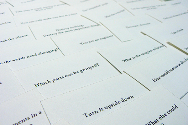
Brian Eno's Oblique Stratergies
“Stop thinking about art works as objects, and start thinking about them as triggers for experiences,” ambient music pioneer Brian Eno wrote in his diary.
We all encounter creative blocks from time to time. Writers suffer from writers' block, but people in all fields of work hit a wall every now and then. Oblique Strategies is a set of cards that offer a little creative inspiration when you need it most.
Oblique Strategies is a deck of 7-by-9-centimetre (2.8 in × 3.5 in) printed cards in a black container box, created by Brian Eno and Peter Schmidt and first published in 1975. Each card offers a challenging constraint intended to help artists (particularly musicians) break creative blocks by encouraging lateral thinking.
Each card contains a phrase or cryptic remark which can be used to break a deadlock or dilemma situation. Some are specific to music composition; others are more general. Examples include:
- Use an old idea.
- State the problem in words as clearly as possible.
- Only one element of each kind.
- What would your closest friend do?
- What to increase? What to reduce?
- Are there sections? Consider transitions.
- Try faking it!
- Honour thy error as a hidden intention.
- Ask your body.
- Work at a different speed.
These cards evolved from separate observations of the principles underlying what we were doing. Sometimes they were recognised in retrospect (intellect catching up with intuition), sometimes they were identified as they were happening, sometimes they were formulated. The real beauty is that there are no "rules" for using them. These are not positive affirmation cards or a Tarot deck. If you feel like pulling one card, pull one; if you prefer four arranged in a square and want to place more significance on the lower left on, then go for it. The idea is to just set your mind off on a tangent, and who knows where it could lead.

Try out more here: http://www.oblicard.com
Why White Space is good
Potential
White spaces are everywhere in a designer's world, especially at the start of a project; the blank white page of a notebook, the blank screen awaiting a web page or the Photoshop canvas awaiting your creation. In fact, we can be thankful as long as we still see a white space around as it significantly tells us of the fact that there are still artistic creations waiting to be conceived.
Nobody Likes Clutter
Before doing any kind of graphics manipulation in a work-space, the physical confinements of the designs are first laid out. A design impact’s potential is often encompassed by the physical confinements of the paper pages’ sizes. In composition, an entire work space is roughly blocked in first. The designer will then limit up the spaces needed to create his/her designs and the white space he/she will be leaving out. You shouldn't try to squeeze too much in though. A crowded and cluttered design is never good, as the image above aptly displays.Simple Is Attractive
Framing
In making a clean, dramatic frame for your photography, graphics, website or images, there may not be another best element than the use of white space. It will be appreciated by viewers and users of your web page very much since it is easy on their eyes. Studies have shown that there’s always a positive response towards a white space. It is because the white space allows a breathing space especially for important graphics like product photos, logos or ads.
Unity & Focus
Your empty design element may not be entirely white, though. It can be any solid background color, but for the viewer, it is still a white, blank, refreshing space that relaxes their eyes. Simply remember that this space is a very important ingredient in coming up with more effective and enjoyable designs and is the simplest way to unite all elements in your graphic design.
Uses of Negative Space
Just as important as that object itself, negative space helps to define the boundaries of positive space and brings balance to a composition. But, negative space is being used cleverly in art, photography and design.
1. Mister Cooper
Designed by Johnson Banks

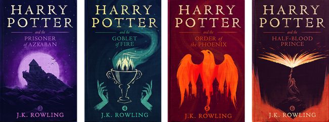
2. Harry Potter Books
Designed by Illustrator Olly Moss
3. The Kama Sutra
Designed by French artist and illustrator Malika Favre

4. FedEx Logo
Designed by Lindon Leader

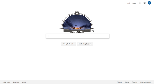
5. Google Homepage
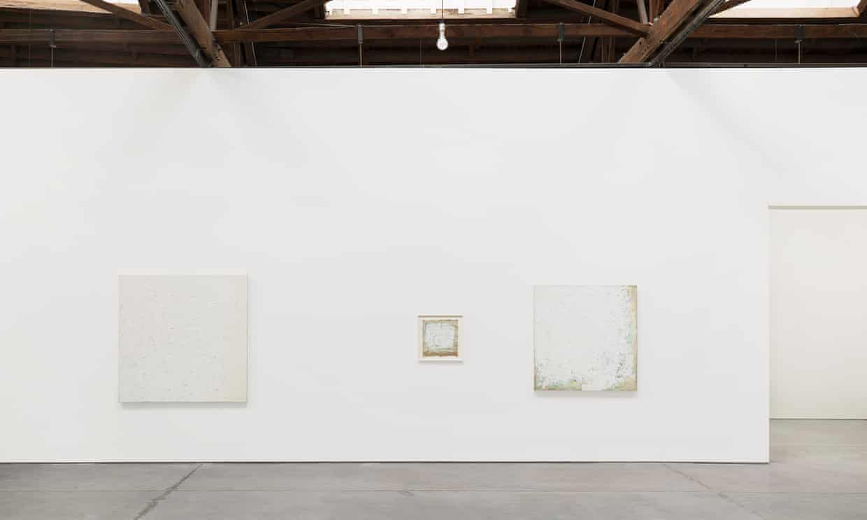
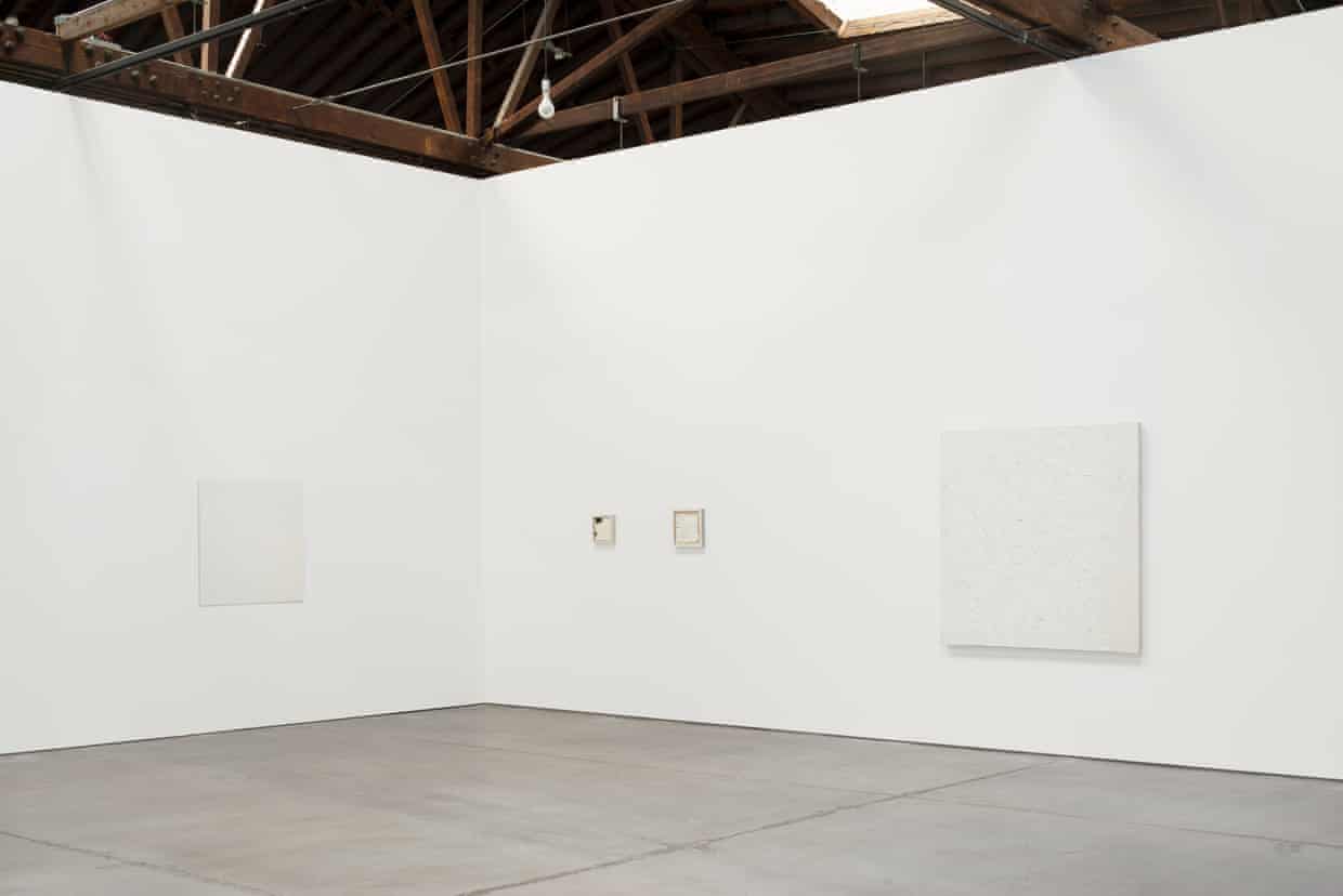
6. Robert Ryman
Ryman is one of the pioneers of Minimalist painting. His works attempt to empty the painting of content - and color - in order to focus almost entirely on form and process. Ryman's work often asks the viewer to reconsider larger questions about the work of art - its placement within the gallery, the figure-ground relationship, its manufactured qualities vs. the hand of the artist, its permanence and boundaries, and others, and in many ways, his paintings become more like objects than flat images. Ryman's works are nearly universally characterized by his wholesale use of white paint - almost to the exclusion of all other hues - which tends to be worked extremely thoroughly to give the surfaces a varied, almost tectonic, three-dimensional quality, so that his working process becomes plainly visible, a technique that can be traced to his formative experiences viewing Abstract Expressionist works.
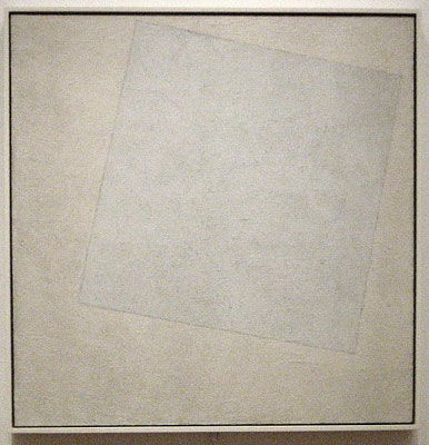
7. Kazimir Malevich's "White on white"
Malevich repeatedly referred to "the white" as a representation of the transcendent state reached through Suprematism. White was the artist's symbol for the concept of the infinite as the white square dissolves its material being into the slightly warmer white of the infinite surrounding. This painting can be seen as the final, complete stage of his "transformation in the zero of form," since the form has almost literally been reduced to nothing. The pure white of the canvas has negated any sense of traditional perspective, leaving the viewer to contemplate its "infinite" space. The slight change in tonality, however, distinguishes the abstract shape from the background of the canvas, and encourages close viewing The picture is thus bled of color, the pure white making it easier to recognize the signs of the artist's work in the rich paint texture of the white square, texture being one of the basic qualities of painting as the Suprematists saw it. Painted sometime after the Russian Revolution of 1917, one might read the work as an expression of Malevich's hopes for the creation of a new world under Communism, a world that might lead to spiritual, as well as material, freedom.